DAJOSHA
Services:
Brand Identity
Print Design
Photo Editing
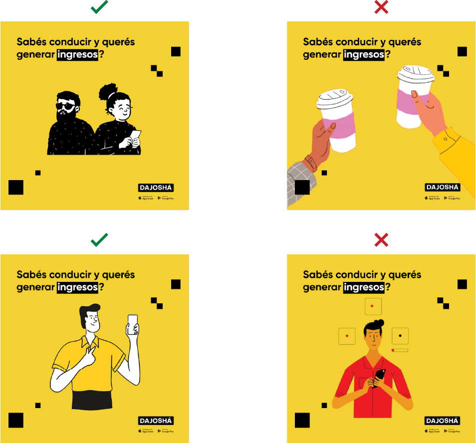
Social Media Ad Design
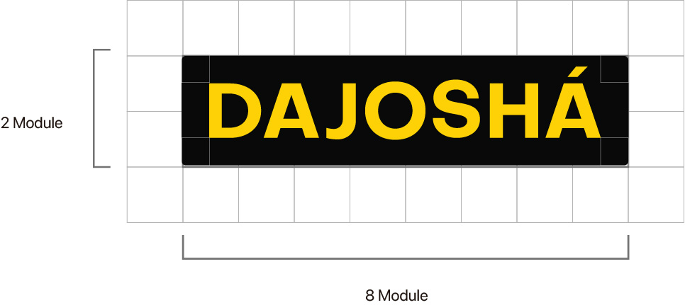
CONSTRUCTION GRID
The following construction grid is used as a foundation to establish correct relationships between the different elements that make up our iso-logotype. These proportions must never be altered. The construction is based on the “x” module.
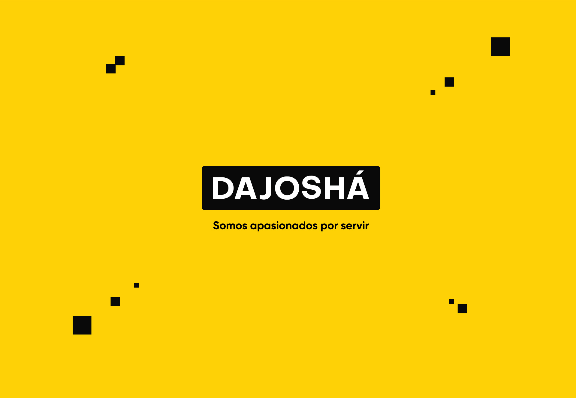
TAGLINE
This tagline is utopian but clearly explains the Foundation’s long-term goal. It focuses on the ultimate purpose: evolution through transformation and implies that commitment makes us responsible for knowledge.

PRIMARY INSTITUTIONAL COLORS
Our color identity consists of two primary institutional colors and a range of secondary colors. The primary colors are black, yellow, and white—a modern combination with strong contrast, aimed at highlighting the strong relationship we seek to establish between agriculture and technology. Below are the color values to ensure consistency across different media and formats. PANTONE and CMYK values should be used for print, while RGB and HEX values are for digital use.
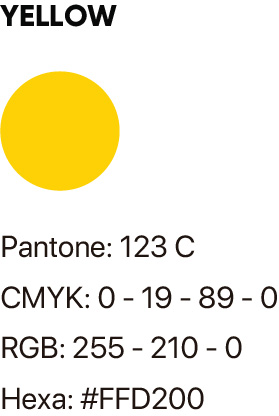
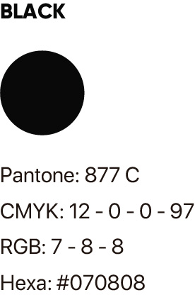
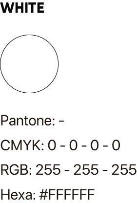
PRIMARY INSTITUTIONAL COLORS



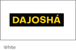
SOLID BACKGROUNDS / Original Version
To ensure the proper application of our brand, we specify which backgrounds maintain the brand’s identity correctly and which backgrounds its use is prohibited.
PRIMARY INSTITUTIONAL COLORS

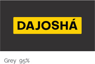
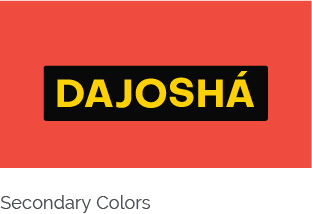
Secondary Color BACKGROUNDS
HIGHLIGHTING ELEMENTS
For headings, we use the following highlighters to emphasize a concept.


Images used are in BLACK AND WHITE
Product or Services
(Center of the image)


Actions
(Close-up)


ILLUSTRATION STYLE
Illustrations are in BLACK AND WHITE with defined lines.


