DAJOSHÁ app
Services:
UX Design
UI DESIGN
ICON DESIGN
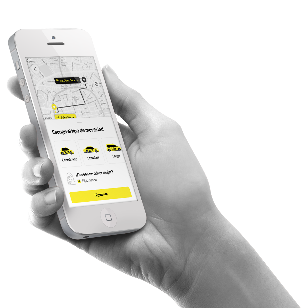
Context and Problem
Transportation in Bolivia presents unique challenges. Unlike in other countries, taxi drivers are not required to have a special license—placing a sticker on the car is enough to operate. This creates uncertainty for passengers, especially women and young people, who face risks when getting into a vehicle without any safety guarantees.
Additionally, the traditional ride-hailing model used by platforms like Uber has struggled in the country due to issues with driver payments. Delays in transfers and a lack of economic stability led many drivers to abandon the platform.
With these issues in mind, the client set out to create an innovative solution: a transportation app with a sustainable business model and a user experience focused on safety and accessibility.


UX/UI Design: Creating a Seamless and Safe Experience
Passenger App: Safety and Trust in Every Ride
For passengers, the main priority was to design an experience that feels intuitive, reliable, and secure. To achieve this, I implemented:
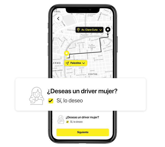
✅ Option to Choose a Female Driver
We understand that many women feel safer when riding with another woman. The app allows users to select a female driver during the booking process, with this option clearly highlighted through intentional visual design.
✅ Accessible and Modern Interface
I opted for a clean design with legible typography and a color scheme that inspires trust. Unnecessary distractions were removed, ensuring that any user can complete their ride in just a few steps.

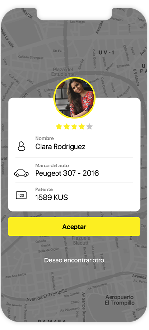
✅ Verified Profiles and Driver Ratings
Each driver goes through a validation process and can be rated by passengers, increasing the transparency and reliability of the service.
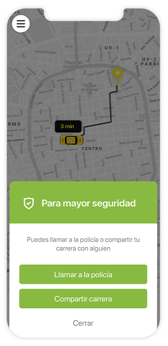
✅ Live Tracking and Real-Time Support
Passengers can track the driver’s location in real time and easily contact support in case of any issues.
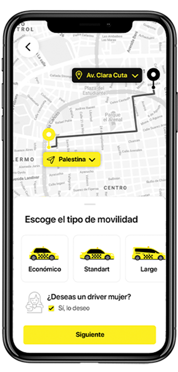
✅ Optimized Booking Flow
From selecting a destination to confirming the ride, the process was designed to be fast and frictionless. Quick-access buttons for frequent destinations and a real-time notification system were incorporated to enhance the experience.
Driver App: Safety and Efficiency on the Move
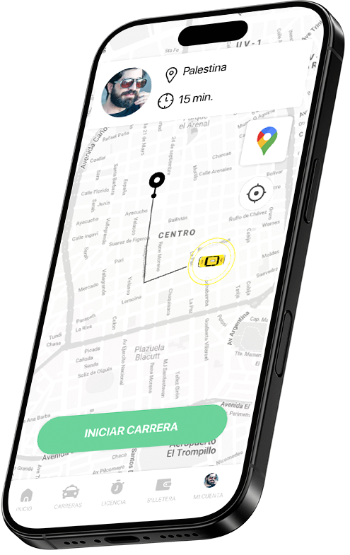
Designing an app for drivers requires understanding their environment: they interact with the app while driving, which means the interface must be simple, clear, and free of distracting elements.
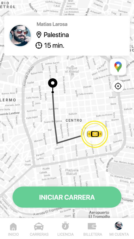
Large Buttons and Typography
The interface was designed with large, high-contrast visual elements so drivers can interact with the app without taking their eyes off the road for too long.

Prepaid Fare System
Unlike Uber and other platforms, this app offers drivers a weekly or monthly subscription model. This provides greater economic stability and eliminates the uncertainty of delayed payments.
Simplified Driving Mode
Once a ride is accepted, the app activates a “driving mode” that displays only key information and minimal on-screen options, reducing distractions and enhancing safety.
Earnings History and Statistics
To help drivers better track their income, the app includes charts and reports of their rides, enabling them to make informed decisions about their work.
Quick Support and Assistance
The design includes direct access to support, allowing drivers to contact the help team within seconds in case of any issues.